
progress
Progress bar
| Attribute Name | Type | Default | Description | Minimum Version |
| percent | Float | Percentage (0~100) | ||
| show-info | Boolean | false | show percentage value at right side | |
| stroke-width | Number | 6 | line weight, in px | |
| active-color | Color | #09BB07 | selected progress bar color | |
| background-color | Color | unselected progress bar color | ||
| active | Boolean | false | loading animation from left to right or not |
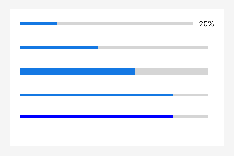
Screenshot
Sample Code
copy
<progress percent="20" show-info/>
<progress percent="40" active/>
<progress percent="60" stroke-width="10"/>
<progress percent="80" active/>
<progress percent="80" color="#10AEFF"/>